User Interface design
Calgary Transit Gap Analysis Mapping Transit Needs vs. ServiceUser Interface design
UEFA Champions League 2021–2022 Player Analysis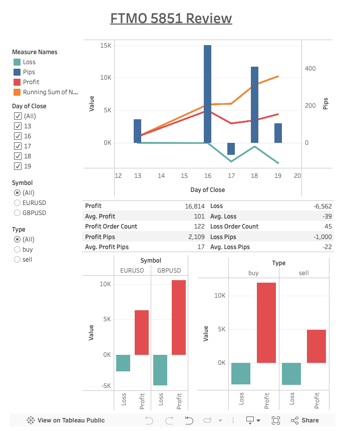
User Interface design
Expert Advisor Trading Analysis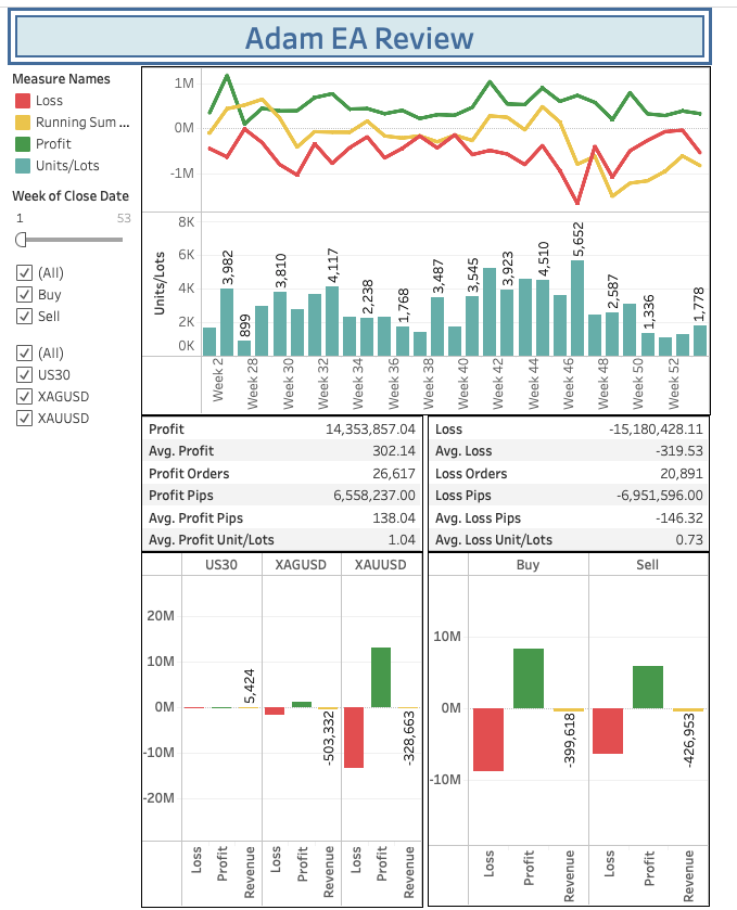
User Interface design
Adam EA Review & Performance SummaryUser Interface design
Calgary Transit Gap Analysis Mapping Transit Needs vs. ServiceUser Interface design
UEFA Champions League 2021–2022 Player Analysis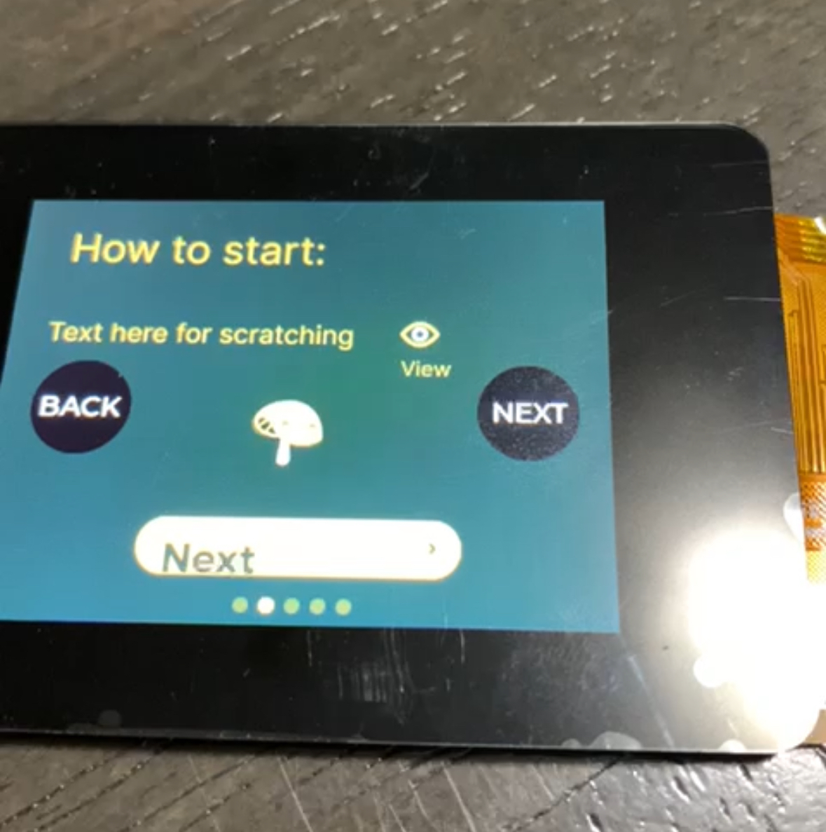
User Interface design
Programming Custom ESP32 Board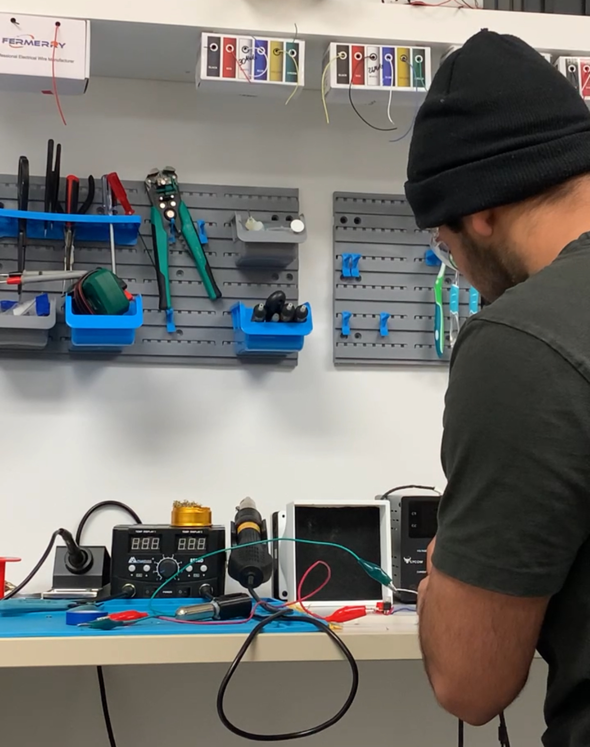
User Interface design
Designing Firmware and Hardware for a Haptic Wearable Startup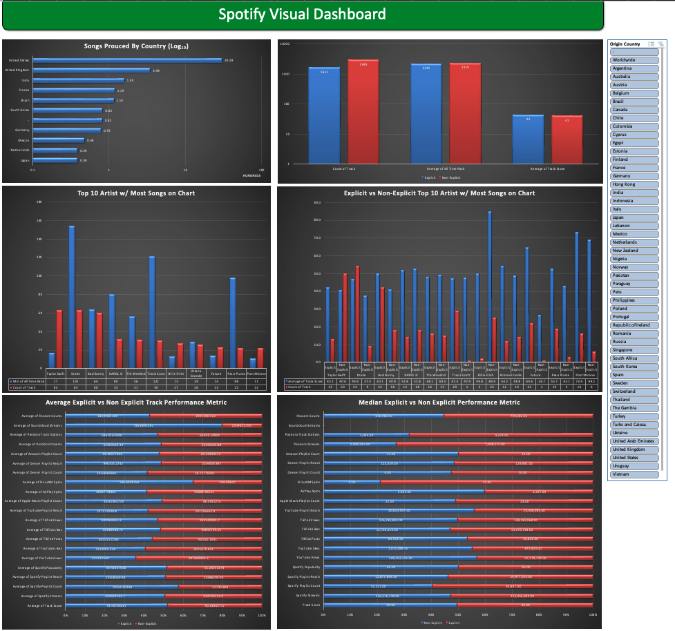
User Interface design
Spotify 2024 Song Chart Analysis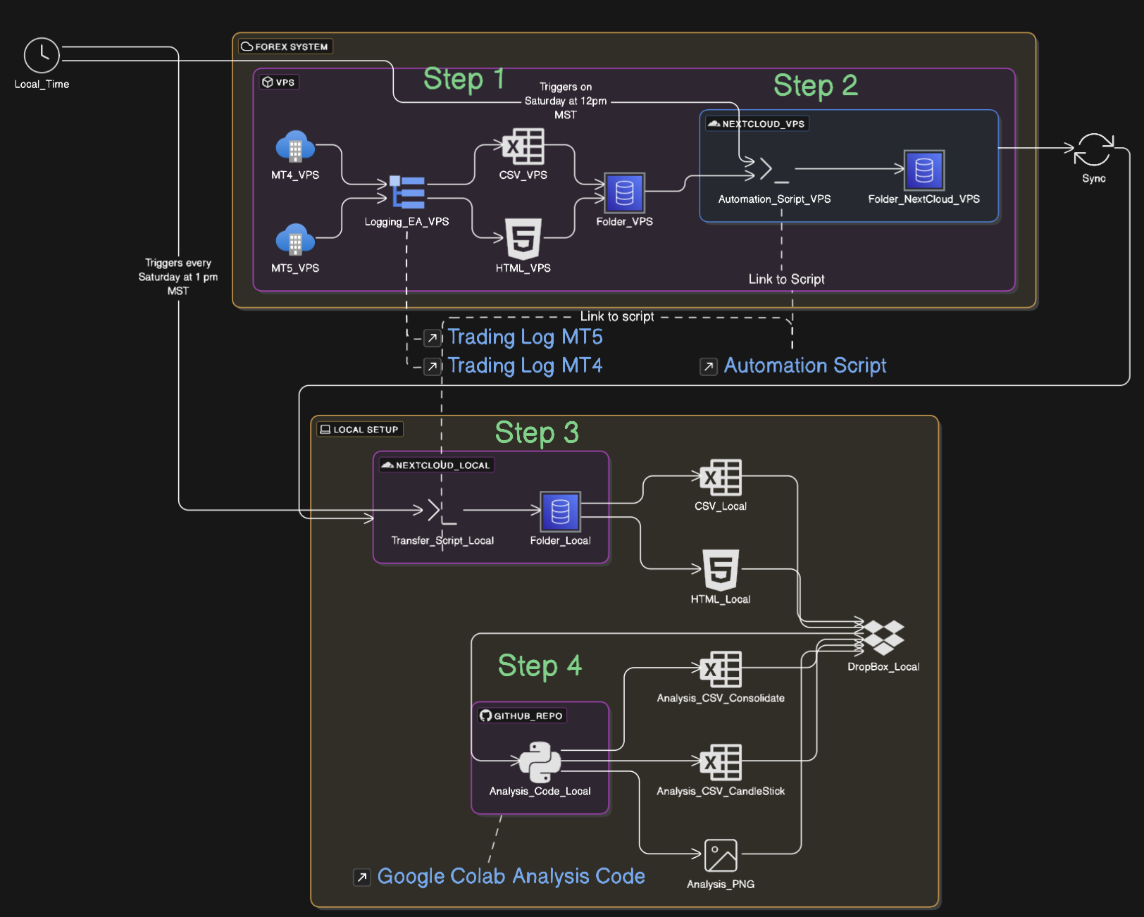
User Interface design
Forex Data Orchestration